Forty years, hundreds of artists, dozens of countries. Infinite cool.
Welcome along to the Poster Art portion of our Star Wars Extravaganza. I’m excited to be talking Star Wars and posters. These are two of my most favorite things. But! You’re in for a treat, too. I know most folks have probably heard the story of the Revenge of the Jedi poster. They decided to change the name after the poster has been produced. Based entirely on the notion that Jedis don’t do revenge. A frustrated Lucas heads down to the printing presses and demands they all be destroyed. Sliced and diced. Later, Lucasfilm sent out some of the non-destroyed versions to members of the fan club. If you’ve got an original of these on your wall, color me jealous.
 Art by Tom JungThere’s more to the poster history than that story, though. It is extended. Deliberate. It has a surprisingly unifying vision. There is a clear graphic influence in presentation from the original Star Wars poster all the way through to The Force Awakens. Rogue One is operating with a different color palette, but much of the design layout holds over.
Hang out with me here for a bit as we flip through a digital flat file of some these terrific Star Wars posters.
Not one Star Wars pun. Crushed it.Art by Howard ChaykinAs Lucasfilm was developing Star Wars, they figured their most likely audience would overlap extensively with your average comic book reader. As a part of that, they approached Marvel to develop a tie-in comic. There’s some really fascinating exchanges between the Lucasfilm publicity folks and Marvel Comics. Basically, Marvel turned them down cold originally because movie tie-ins didn’t sell. Ultimately, they did agree to publish the tie-in provided Lucasfilm received no royalties until 100,000 comics in the line were sold. Then they could renegotiate. Well. Mistake.
Star Wars was in theaters forever and also happened to be a cultural juggernaut. There’s more than one source attributing Marvel’s financial success for 1977 and 1978 to the sales of that run. There’s a really neat book by Garry Jenkins called Empire Building: The Remarkable Real-Life Story of Star Wars that gets into this story.
Howard Chaykin was the illustrator brought on for the first 10 issues of the comic run. He also got first shot at a poster for the film. The comic start is interesting. That display of characters over an impossible environment runs all the way through to today’s Star Wars posters. Getting an audience to appreciate a new setting, cast of characters, themes, and tone of a story is something comic book artists are quite familiar with when it comes to cover art.
 Ralph McQuarrie Early ConceptsThe influence of Ralph McQuarrie on Star Wars is impossible to overstate. Like, the guy designed the look of Darth Vader, C-3PO, and R2-D2. Just let that sink in for a minute.
On top of that, he had a role in almost every visual aspect of Star Wars. He did story boards, matte paintings, posters, concept art, and well. Everything. The above are four concept posters that McQuarrie put together. I think they’re fantastic. You can see the really wonderful designs of the Death Star. He takes a slightly different approach than Chaykin. Rather than overlay the characters in space, they appear to be tethered to the ground. That allows the Death Star to loom over them, almost like a small moon. I apologize. That won’t happen again.
I find the bottom two with different takes for Leia’s character to be particularly interesting. One has her in a typical sort of, erm, subservient pose. The one on the right has her as she is in the movie: gun in hand and all out of bubble gum.
 Ralph McQuarrie Star Wars Symbol WorkIf you really want to splash out on something wild, there exists an 800 page hard cover slip case with 2,000 McQuarrie color illustrations inside it. It’s called Star Wars Art: Ralph McQuarrie and it’ll run you around $160.
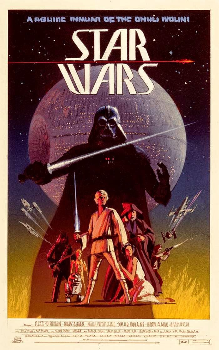
 Art by Tom JungIn 1977, Tom Jung was working as a freelance illustrator for the advertisement firm Lucas went to consult with for marketing and promotional materials. He was given the theme of good versus evil. There’s a strong element of Fantasy art to the work. Honestly, it feels similar to Frank Frazetta’s Conan work. Obviously the space element is different, but it definitely carries the spirit.
I think that explains the way they went for Leia’s pose in the piece. Her pose doesn’t really mash up at all with her look and character in the movie. At least she’s standing here. And she’s got a gun. But, still. You know what, though? That Luke doesn’t look like he’s ready to whine about going to get power converters at Tosche Station. He just goes. So much muscle!
That said, the Jung poster is in my top three.Tom Jung with an introductory background to Star WarsThis is fascinating, isn’t it? In the year 3000! “When mankind knows every alien being in an infinite universe.” Like, I dig it. “When a billion suns and all their planets are controlled by a single, awesome force.” Amazing. All types of marketing pushes when you’re trying explain to audiences your new genre mashup.
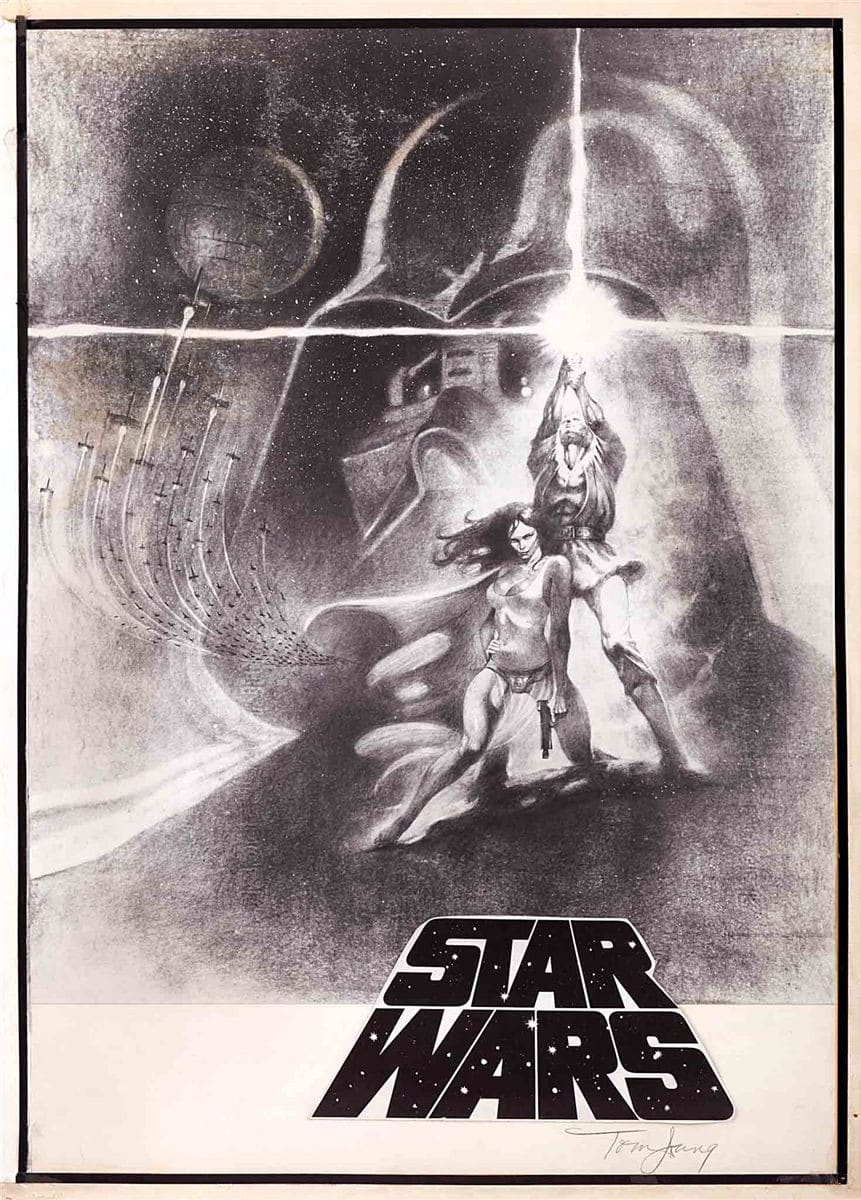 Tom jung SketchesIt’s neat to see the sketches. Leia may be in a sultry pose, but she has fierce thigh muscles in the one on the right. Despite the awkwardness of the pose, she’s much more intimidating.
 Art by The Brothers HildebrandtSo, what’s with the seemingly duplicate poster from the Brothers Hildebrandt? Well. Lucasfilm didn’t like how dark Jung’s poster was. They called in Tim and Greg Hildebrandt and gave them thirty six hours to make something not “too dark”.
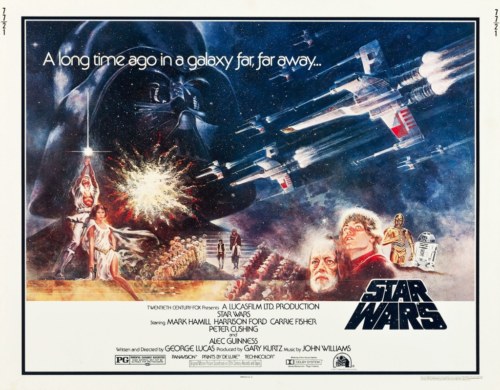
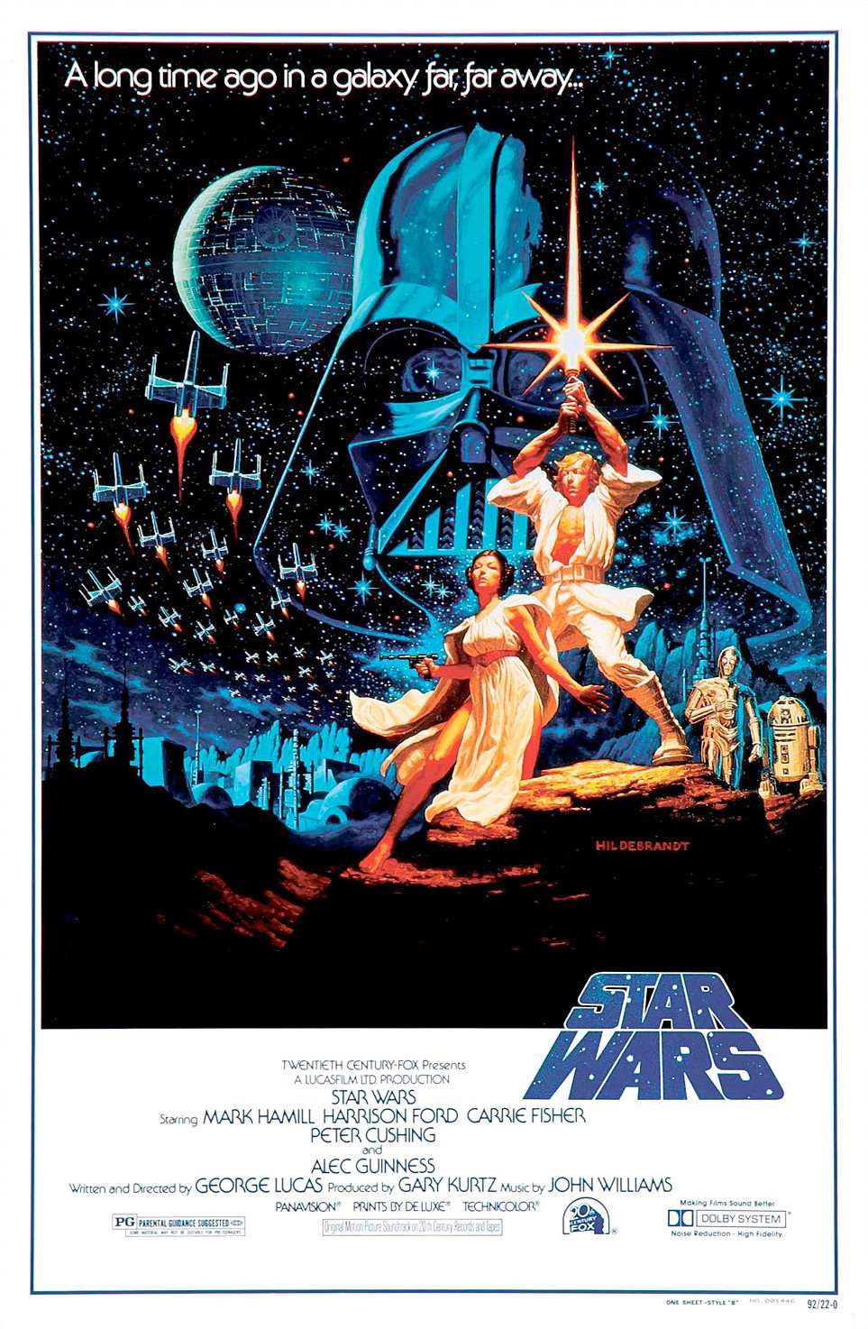
 Hildebrandt Brothers Original PaintingTheir original painting lacked the droids, which were added prior to distribution. Leia is more active, but some how less intimidating. It may be the thrust out chest that’s throwing me off. It is a gorgeous work of art though. The interesting thing is that after all that crash work, Lucasfilm went with Tom Jung’s version for the American release. The Hildebrandts’ work was used briefly in the UK, but that’s it.Art by Tom ChantrellAlright, this is it. This is the Boss poster. This one is my favorite. One of the issues they were trying to address with this version was that the other posters featured effectively generic characters. Well, not generic. But, not at all based on the likenesses of the actors playing the roles. Lucasfilm started marketing Star Wars as a concept, exampled in large part by a comic book run prior to the release of the movie. I think the sort of anonymous character look worked fine to sell that. But, as soon as the movie is released and people get to know their heroes, you’ll want something to remind them of the actual movie.
Tom Chantrell was asked to make the below. He had the added bonus of having actually seen the film prior to developing his approach. He also had extensive access to character stills and plenty of time to work. And it is phenomenal. Look at Leia’s expression! And her whole pose. He nails it. We have our actual heroes. We have our villains. We have our space battles. We have our Death Star. We have our laser guns and a light saber. And we have the Star Wars title treatment. And we have our droids! ::Chewbacca victory cry::
I love this poster.Tom Chantrell Half SheetThis is the original work that was used to create the poster above.
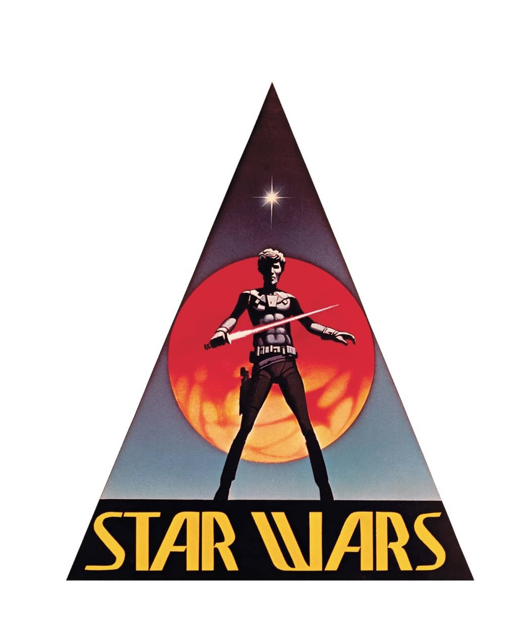
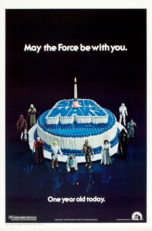 Look at that merchandising. Just look at it.When is the last time you’ve seen a poster production for a one year anniversary of a movie? I suppose these days for Star Wars, the One Year anniversary release of the last movie will just be another Star Wars movie. That’s a pretty good gift.
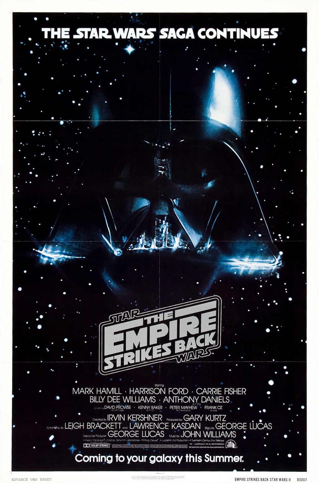
The marketing plans and accompanying posters vary quite a bit in part due to the length of time Star Wars was in theaters. It’s first run went from 25 May 1977 to 20 July 1978. However! Due to overwhelming demand (and/or classic marketing moves to drive up fears of scarcity) the film is immediately re-released the next day and the run is extended to 07 November 1978. Whew! That’s nuts.Drew Struzan and Charles White IIIThat’s the extended release poster and Drew Struzan’s introduction to the Star Wars marketing. Any road, Star Wars is re-released again on 15 August 1979 for a few weeks. Then, it’s back again on 10 April 1981 for a couple of weeks. And then again on 13 August 1982. That’s an astounding theater presence to keep up. It’s a big part of why there are so many different well known official marketing posters for Star Wars.
Guess who’s back. Back again. Guess who’s back. Guess who’s back. Guess who’s back. Sorry, this is a lot of posters and I needed a moment. Okay. I’m back.
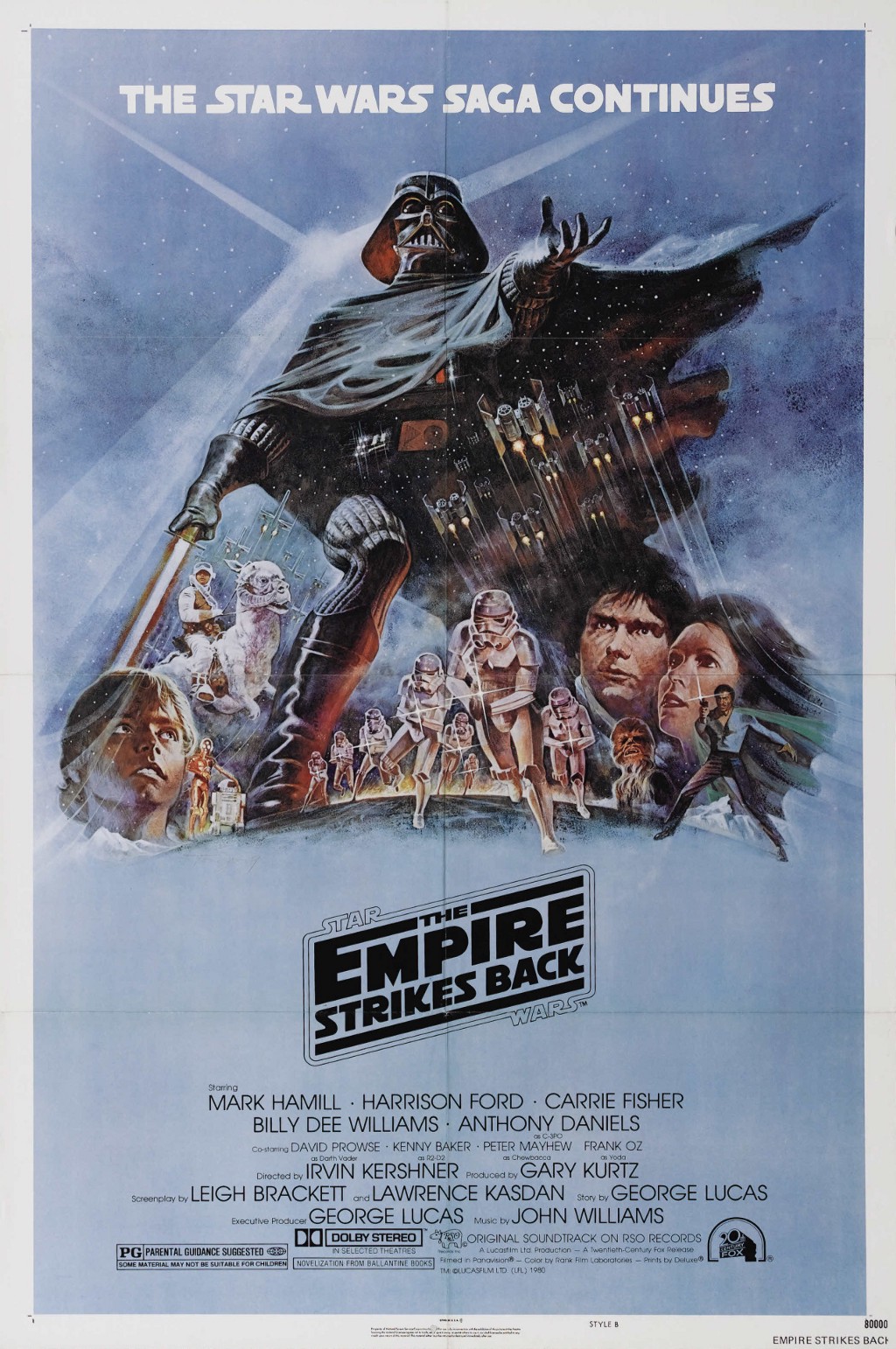 Art by Tom JungTom Jung carried on his work with a poster for The Empire Strikes Back. But, they also recruited Roger Kastel to contribute art for this effort. You may not recognize the name, but he’s the fella who created the Jaws poster. You know the one. Yeah.
 Art by Roger KastelI love this poster. Top three, for sure. But, my pillow case says “I know” and my wife’s says “I love you.” So. I’m pretty much in the bag for this one. Obviously I love the characters. I like the color palette. Particularly how Hoth is alluded to rather than accurately depicted with those jagged icy blue swipes at the bottom. For my taste, that meshes nicely with the photo-realistic work on the characters.

 Art by Josh KirbyHere’s another really cool turn of events. When Return of the Jedi was ready to come out, they approached Josh Kirby. He’s another person whose name you might not recognize. However! Have you ever read a Discworld book by Sir Terry Pratchett? Josh Kirby created the cover art for more than twenty-five of those books. There’s so many amazingly talented people involved with the art of Star Wars.Art by Drew StruzanThe Struzan Era really kicks off here. As mentioned earlier, he got involved at the invitation of Charles White III for the extended release poster. He’s another name you might not recognize, but who has done amazing work. He’s done posters for the Harry Potter movies, Big Trouble In Little China, the Indiana Jones movies, Back to the Future, Blade Runner, Hook, Goonies, and so many more.
He also designed the infamous Revenge of the Jedi poster. And, it’s where we start to see his shift towards a two color approach to his posters for Star Wars.

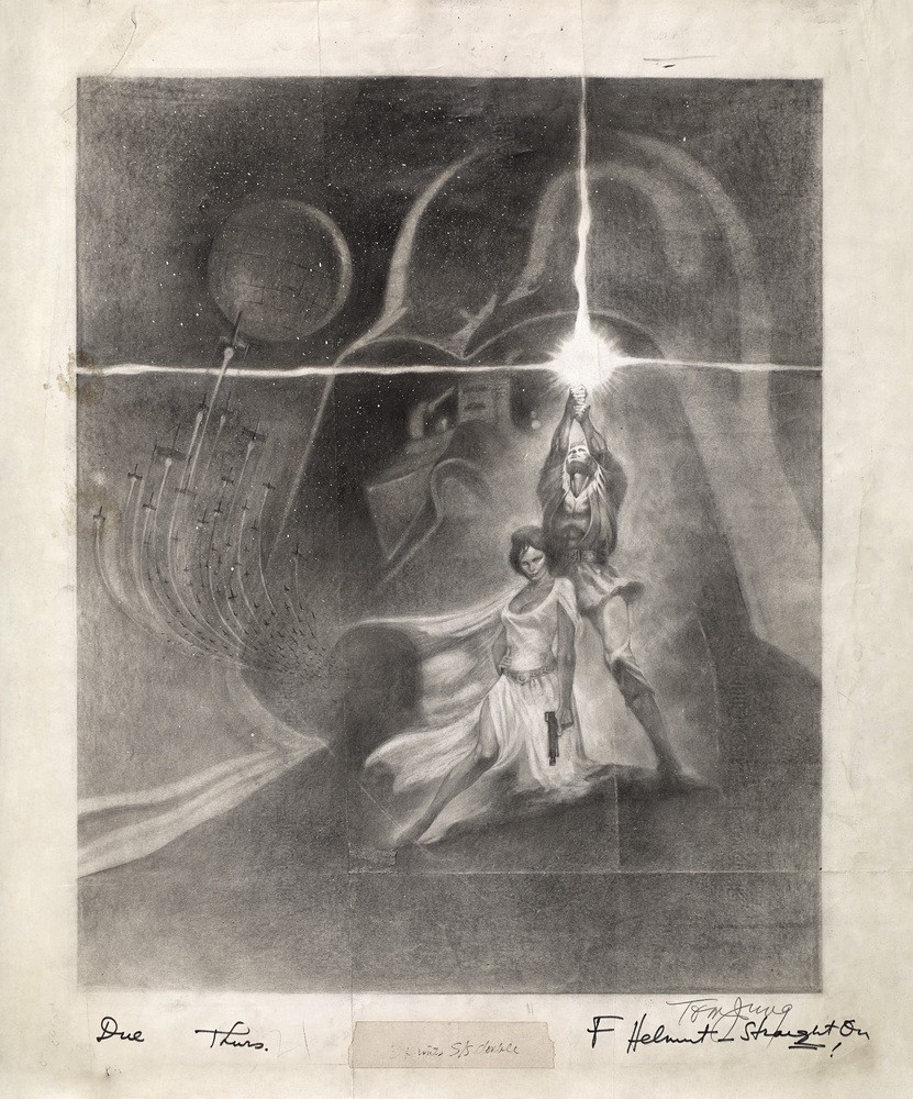
 Struzan Concept ArtI’ve always been particularly interested in processes. Like, how does that amazing thing get made? What are they thinking? How do they get there?Concept art sketches are my jam.

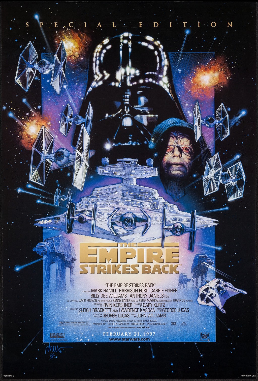
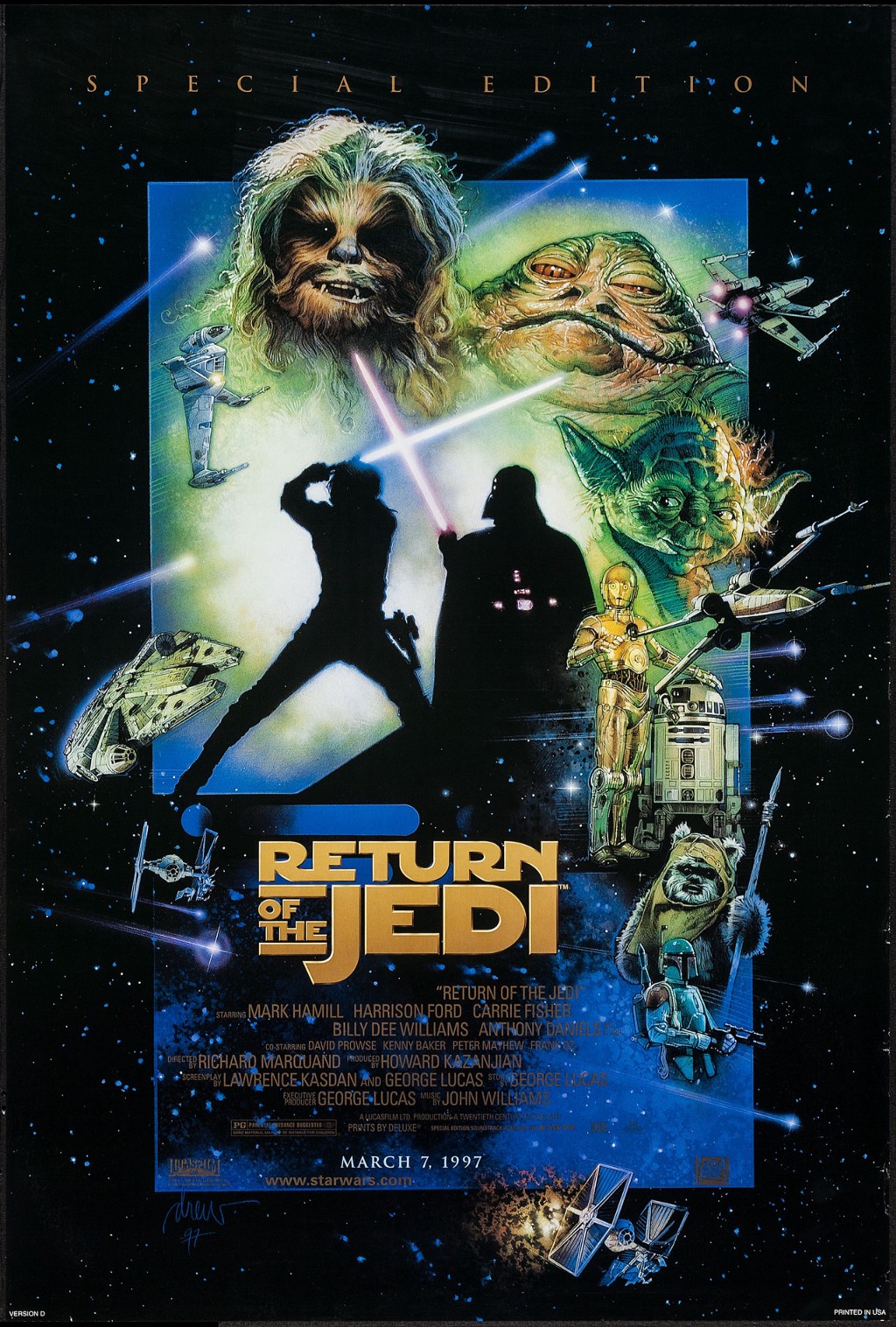 Art by Drew StruzanAlright, nerds. Yes. Those are the Special Editions. Remember, anger leads to hate! Hate leads to fear! Fear leads to the dark side! I know the Special Editions are contentious. I have thoughts on that, too. But, look. The art is dope. Individually, they’re solid posters. Bold, defined color palettes. The key characters brought to life. Take a look at the below shot, without the title treatments and gaps.Art by Drew StruzanIndividually, they seem to be varyingly arranged. But, all together you can see that he’s balancing the Dark and Light sides of the force in his poster art. All of a sudden, the shift in color palettes isn’t as much as it feels like above. Also note how the lines exploding from the middle poster line up with those appearing on either side. It’s fantastic stuff. I really dig this piece.
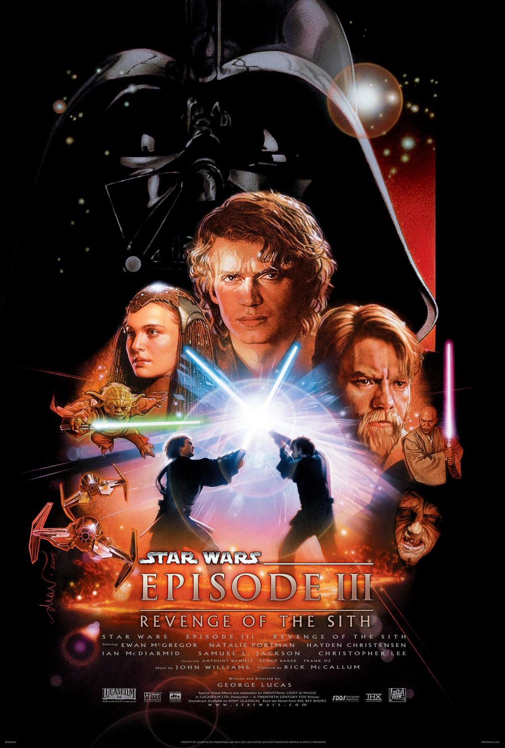
 Art by Drew StruzanStruzan stayed on with Lucasfilm, producing the poster art for Episodes I, II, and III. For me, I love Darth Maul’s eyes at the top of the piece for The Phantom Menace. This stretch is where he really puts his stamp on it.
 Art by Drew StruzanThese posters are unabashedly in true to his style. He continues his strong use of opposing colors to visually depict the balance of the force. In this orange and teal.

 Struzan Sketchwork for Episode IIThis is a saga, so striking a tone while highlighting the importance of characters is important work for a poster. I love watching Struzan work through his composition ideas in the sketches.
 Art by Drew StruzanThe rise of Vader overshadows everything.


I love in the sketch how Obi Wan and Anakin have their backs turned to each other. The betrayal is inevitable.
 Art by Bryan MortonStruzan ultimately opted not to take on the theatrical release poster for The Force Awakens. I recall a flare of frustration from fans set on Struzan carrying forward his role. I also recall a lot of dissatisfication with the poster above. Art is subjective. I dig it. I like the colors. I like the stacking of the characters. I like the visual cue of who our hero is going to be. And our villain.
More than that, if you start at the top and scroll down to this poster, you can see all of the traditions kept alive by Morton as he put this piece together. There are opposing colors. Photo realistic depictions of our heroes. It’s got space battles. Light sabers. Droids! And a great big looming (Not A) Death Star. And it definitely isn’t dark.
 Art by Bryan MortonAfter all this, I’m sitting here wondering. Hold up. Why are Rey and Finn on either side of the poster? Is there a clue to one of their fates come Episode VIII? Probably not. But, maybe!
Some trends continue. Some don’t. The color palette here isn’t as diametrically opposed. It’s more a shift in tone. But, we’ve still got looming (Yeah It Actually Is The) Death Star and Vader’s face is perfectly superimposed onto it. No space battles, though. Not exactly.
So. That’s the look at the posters from Star Wars right on through Rogue One.
Here’s some international poster goodies for you.
From Hungary:
Art by Andras Felvideki

 Art by Tibor Helenyl
From Japan:

 Art by Selto
Here’s some art from Noriyoshi Ohrai:

 Art by Noriyoshi OhraiLook at that Return of the Jedi poster. I think it’s a top 5 favorite of the commercial Star Wars posters. Just look at it! Also, here’s some of his magazine work for Star Wars.
 Art by Noriyoshi Ohrai
Some art from Russia:


 Left to Right: Igor Majstovsky; Alexander Chantsev; Yury Bokser and Alexander Chantsev
My favorite from Russia:
Art by Alexander KulovFrom Poland:

 Left: Jakub Erol; Right: Wojtek Sludmak
More from Poland:
Both by Miroslaw Lakomski and Jakub ErolFrom Italy:
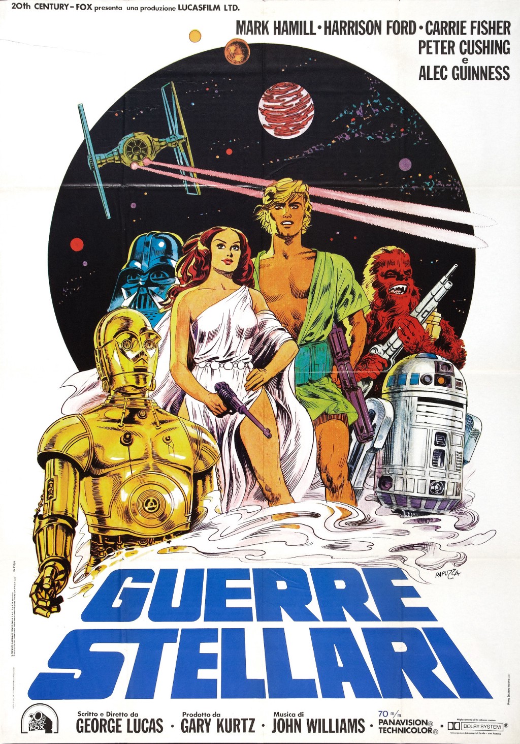 Art by Michelangelo PapuzzaMore than anything, I hope you take away from this that even the commercial art for Star Wars is legion. People could write books about this. It’s one of the widest known cultural references in the world. And the amount of art out there reflects that.
I couldn’t have done this without an Internet. There are literally books written on this topic. And, there are tons of sites around the internets aggregating this information. I learned the most from one source in particular. If you dig posters at all, I strongly recommend this podcast. Go check out the Poster Boys or @PosterBoysShow. They are Brandon Schaefer (@seekandspeak) and Sam Smith (@samsmyth). Their episode on Star Wars posters taught me that there was this amazing story out there. More than that, they do deep dives into artists and collections of posters. Give them a look.
There’s also the Star Wars Art: Posters (Star Wars Art Series) book. Roger Kastel does an introduction and Drew Struzan writes the foreword.
So, what are your favorite Star Wars posters? Fan art, too. Call them out in the comments below. Make sure you shout out the artists. Let’s start building a collection here.

Writer for Film School Rejects. He currently lives in Virginia, where he is very proud of his three kids, wife, and projector. Co-Dork on the In The Mouth of Dorkness podcast.