‘Logan Noir’ and A Brief History of the Black-and-White Cut

In praise of monochrome: why black-and-white remasters aren't just a gimmick, and what they can teach us about visual storytelling.
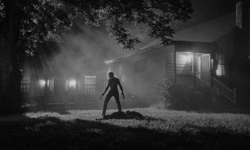
Logan Noir Standing

The first time I stumbled across a black-and-white promotional still of Stephen Merchant’s Caliban in Logan Noir, I lost my breath. Here was this gunslinging golem, stooping in the dark, punctured by beams of light. It was inconceivable to me that this was a character from an X-Men movie. There was a gravity to this photograph I hadn’t come to expect from superhero films, from a genre that routinely confuses brooding for depth.

Director James Mangold took photographs on Logan‘s set and noticed how strikingly the film translated to black-and-white. More specifically how “the western and noir vibes of the film seemed to shine in the form and there was not a trace of modern comic hero movie sheen.” Mangold and DoP John Mathieson “shot lotsa night w/ sculptural black & sidelight separating actors from [the background].” They “were making a color film but were all conscious that the hard edge lighting schemes would play well in monochrome.” The stills, wisely used for promotion, offered a visual shorthand for Mangold’s startling vision of a well-trod franchise. It wasn’t long before rumors of a black-and-white cut began to percolate. These suspicions were recently confirmed, with the justly-named Logan Noir receiving both a home video and limited theatrical release.

Beyond being aesthetically pleasing, in black-and-white, Logan reaffirms its family resemblance to Westerns like Shane, The Shootist, and Unforgiven; late-career films where a weary beloved character lurches out of retirement for one last job. In this way Logan’s monochrome evokes a dignified severity befitting a send-off. As film critic Brian Tallerico notes, the real villain of Logan is time. That we’re bearing witness to a decaying past is implicit in the monochrome itself.

Logan Noir’s announcement spurred some critics tomonochrome remasters a “trend.” This is particularly unfair slander because there are too few examples for it to be even remotely considered a movement. As for the accusation that black-and-white cuts are pretentious gimmicks —one has only to look at the history of black-and-white remasters to see that they come from a place of directorial purpose. That, overwhelmingly, rather than being a shtick for shtick’s sake, the monochrome is narratively justified.

The Mist

Black-and-white release: 2008

The DVD release of Frank Darabont’s The Mist included a two-disc special edition with an exclusive black-and-white cut of the film. Contemporary post-production involves a digital intermediate rather than cutting negative. As a result, modern filmmakers can shoot in color and still release a black-and-white print. Darabont always envisioned The Mist as a black-and-white film, but the studios weren’t convinced that it would be profitable. They thought that audiences might “think it old fashioned or out-of-date, or that it [didn’t] look real.” In his introduction on the DVD, Darabont continues:

“That [it doesn’t look real], to me, is what makes black-and-white so very cool. No, it doesn’t look real. Film itself [is a] heightened recreation of reality. To me, black-and-white takes that one step further. It gives you a view of the world that doesn’t really exist in reality and the only place you can see that representation of the world is in a black-and-white movie.”

Black-and-white as a visual indicator of otherworldliness is perfectly suited to The Mist — to a story about an alien dimension spilling out into our own, to the boundaries between their world and ours becoming permeable, and porous. As such, through monochrome The Mist becomes a liminal space, not unlike the town of Bridgton itself.

Being in black-and-white accentuates The Mist’s ties to “that mid-60s Night of the Living Dead, pre-color Ray Harryhausen era of film.” In Skeleton CrewStephen King describes how The Mist took inspiration from the grainy, black-and-white Bert I. Gordon monster movies of his youth. According to Darabont the color version wound up feeling “like a mid-70s kind of movie.” Meanwhile, in black-and-white, it is “a completely different viewing experience.”

Speaking of which: The Mist is much scarier in black-and-white. There is a palpable fear in that horrible moment when the air-raid sirens first sound, when a petrified, bloody Jeffrey DeMunn sprints towards the grocery store. The generator room scene also stands out: how when the garage door opens the mist hovers for a little too long; how it floods the garage with light; how Norm the bag boy maintains eye contact as the fog swallows him up. While less supernatural, Mrs. Carmody blowing out her prayer candle, plunging the frame into darkness, is equally terrifying. In black-and-white, the mist itself feels more oppressive and monstrous. It is a backdrop for what feels like a much moodier, more serious rendering of King’s story: a parable about the terrible things people can do to each other when confronted with the unknown.


Sympathy for Lady Vengeance & Mother

Black-and-white release: 2005; 2013

There’s a second version of Park Chan-wook’s Sympathy for Lady Vengeance that begins with vibrant hues, gradually fades to pastels, and concludes in black-and-white. The literally-named “Fade to Black and White” edition played in select theaters equipped with Digital Light Processing and was released on DVD. It is said that Park Chan-wook’s prefers this version.

Most explicitly, the gradual desaturation externalizes Lee Geum-ja’s progressively cold demeanor, as well as the clarity she hopes to achieve by exacting her revenge. As she dissolves, becoming more and more sinister, the film follows suit; slowly draining of color into an uneasy monochromatic purity. Color-stripping a finale where, like the visuals, ethics distill to black and white, is particularly gut-wrenching.

Bong Joon-ho’s black-and-white cut of Mother plays to a similar tension. While the protagonist believes in a clear-cut distinction between right and wrong, things aren’t always so simple. The film follows a mother trying to prove her mentally-challenged son’s innocence in the murder of a local girl. Consequently, in monochrome Mother’s Hitchcockian undercurrents become more pronounced — harsher, bleaker, and more somber.

Bong Joon-ho presented Mother’s black-and-white version at the Mar Del Plata International Film Festival. It was later released on home video in South Korea. To prepare the cut, Bong Joon-ho and DoP Hong Kyung-pyo performed shot by shot color-correction. In an interview with ScreenAnarchy, Bong Joon-ho stated:

“It just started out of curiosity with my DP; what would it feel like as a black-and-white film?…I saw different things in the performances as well. I’m not quite sure, but just little details came to the surface more. For the overall film, I felt that the black-and-white sort of focused your view of that. So, if the government said, “you have to pick one version over the other,” I would want the black-and-white one to survive.”


Raiders of the Lost Ark

Black-and-white “release”: 2014

During his “retirement,” Steven Soderbergh never stopped thinking (and thankfully, writing) about what makes good cinema. On his excellent blog Extension 765, Soderbergh uploaded a black-and-white version of Raiders of the Lost Ark to illustrate how a talent like Steven Spielberg was able to communicate so much story through merely shot length and composition. To further “aid you in your quest to just study the visual staging aspect,” Soderbergh substituted Raider’s original audio for Trent Reznor and Atticus Ross’ scores for The Social Network and The Girl with the Dragon Tattoo.

In black-and-white, Spielberg’s genius is deafening: scenic elements align masterfully; dynamic lighting showers mise en scène with significance; and the editing sings us seamlessly from scene to scene. But beyond being a brilliant teaching tool, like The Mist, Raiders’ monochrome stresses the franchise’s ties to genre. More specifically, to the black-and-white matinée serials of the 1930’s; to strong-jawed heroes and daring feats of courage. In particular, Indy’s mythic nature is all the more obvious in monochrome; the stakes all the more pressing when cloaked in shadow. Also, to quote Soderbergh: Raiders “LOOKS AMAZING IN BLACK AND WHITE.” Much of the “fuck that’s gorgeous” is a product of cinematographer Douglas Slocombe, who shot black-and-white masterpieces like The Lavender Hill Mob and The Servant. Honestly, you’d be forgiven for thinking that Spielberg had always intended for viewers to see Raiders to be seen this way.


Mad Max: Fury Road

Black-and-white release: 2016

One of the innumerable ways in which Fury Road distinguishes itself from its peers is through its vivid use of color; its scorched reds, piercing blues, and acid yellows. Curious as it may seem to strip the film of such an essential quality, George Miller has a precedent for favoring Max in monochrome: “the best version of Road Warrior was what we called a ‘slash dupe,’ a cheap, black-and-white version of the movie for the composer…something about it seemed more authentic and elemental.” After having Fury Road’s colorist Eric Whipp mock up some scenes in high contrast black-and-white, Miller was ecstatic. Unfortunately, there wasn’t enough room on the initial DVD release, but luckily it wound up on a special “Black & Chrome Edition” that yours truly bought one drunken night on Amazon.

Regarding Fury Road’s coloring and de-coloring, Miller had this to say:

“One thing I’ve noticed is that the default position for everyone is to de-saturate post-apocalyptic movies. There’s only two ways to go, make them black-and-white , the best version of this movie is black-and-white, but people reserve that for art movies now. The other version is to really go all-out on the color. The usual teal and orange thing? That’s all the colors we had to work with. The desert’s orange and the sky is teal, and we either could de-saturate it, or crank it up, to differentiate the movie.”

Fury Road’s well-documented common ground with silent film is indisputable in black-and-white. Miller’s early cinematic education was watching drive-in movies without sound; there, “[he] realized that the basic syntax of film…that all film language is defined by silent movies.” As Varsity’s Pany Heliotis notes, in chrome, Hardy’s performance takes on a new character; “suddenly his bold (read: ostentatious) physical choices look like he’s channeling a steroidal Buster Keaton.” In black-and-white, Fury Road becomes a biblical eco-morality tale; a more self-consciously kinetic, grand, and grainy stream of motion. Like Miller says: there’s “something about black-and-white, the way it distills [Fury Road], makes it a little more abstract…losing some of the information of color makes it somehow more iconic.”


In a recent essay, video game creator and noted film-buff Hideo Kojima discussed the broader cinematic implications of the Black and Chrome edition. Most interestingly, how his familiarity with the full-color original influenced his viewing. Effectively, this is true of all monochromatic remasters; that first and foremost they are seen in relation to not being in color. This awareness, in conjunction with black-and-white’s dated coding, produces a strange flavor of nostalgia; a longing for genre, palpably visual storytelling, or even a familiar vision of the post-apocalypse. Monochrome remasters are enthusiastically black-and-white, rather than black-and-white by convention or necessity. They do not exist to make money, to self-aggrandize, or to pander devilishly to the past — they exist because, overwhelmingly, the director preferred how the visual language of black-and-white articulated the film’s story.

While Kojima considers Black and Chrome a cinematic achievement he doesn’t think it represents the future of film. Although I see his point, I’m not entirely sure that I agree. I have to believe that in the future there’s a space for directors with the cultural and technical fluency to execute monochrome; that we’re still producing the brave and bold narratives that necessitate the visual language of black-and-white.

Logan Noir will screen in select Alamo Drafthouse locations on May 17th, 2017. Meanwhile, the rest of us schmucks can catch it on 4K, Ultra HD and Blu-ray May 23rd, 2017.

Meg Shields: Based in the Pacific North West, Meg enjoys long scrambles on cliff faces and cozying up with a good piece of 1960s eurotrash. As a senior contributor at FSR, Meg's objective is to spread the good word about the best of sleaze, genre, and practical effects.