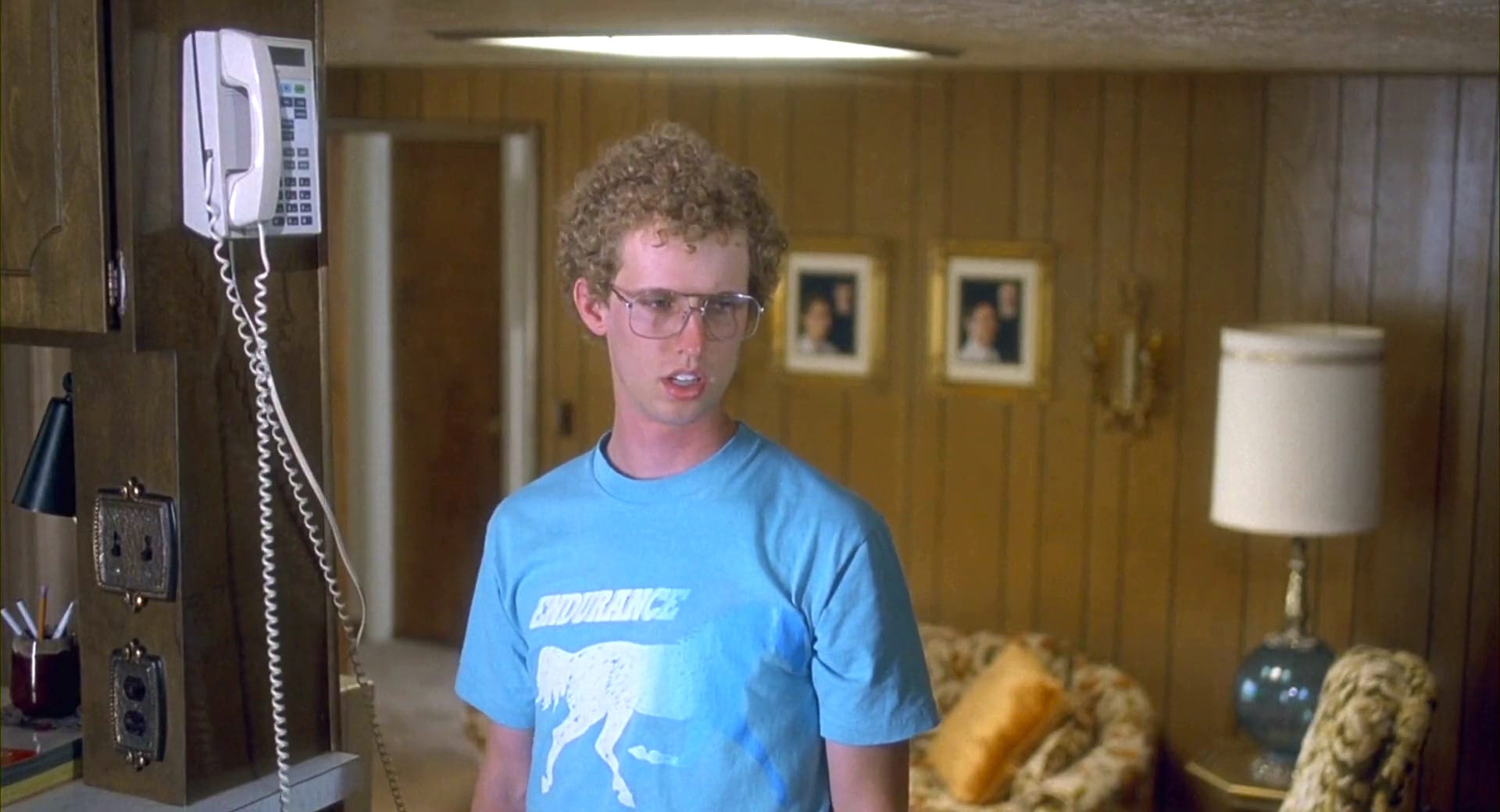
These colors are washed-out and washed-up.
The cinematography of most indie films values practicality over all else. Your budget is small, your schedule is hurried. You’re shooting for speed and efficiency. But there’s always room for art. Look at Napoleon Dynamite’s director of photography, Munn Powell.
Powell created a pastel lookbook that shaped Urban Outfitters for years to come and made the world of losers feel real. Everything seemed a little worn and a little faded, which was perfect for a film about small-town quirk.
Rachel Coe’s video essay deconstructs all the colors populating the cringe-inducing, low-rent, low-stakes lives on screen during this movie. These browns, pale blues, and weak yellows make the film seem tepid and primed for zany, ironic undercutting.
Related Topics: Cinematography, napoleon dynamite, Video
