If you were to look under my bed at age 13, you would discover three massive coffee table books. One would be the “Icon: A Frank Frazetta Retrospective,” another would be “The Art of James Bama,” and the third would be “J.R.R. Tolkien: Architect of Middle Earth” as illustrated by Tim and Greg Hildebrandt. Now, if you were to break into my house these days, you would find all three of those books respectively on the shelf, properly alphabetized alongside other artistic wizards like John Alvin, Clive Barker, Julie Bell, R. Crumb, Basil Gogos, Ray Harryhausen, Ken Kelly, Robert McGinnis, Bob Peak, Drew Struzan, etc. The list goes on and on, as does my obsession for fantasy and film illustration.
These guys defined my love for literature and cinema as much as the novelists and filmmakers themselves. To gaze at an astonishingly realized painting of Middle Earth was to step into that world. There I could dissect the fashion, the landscape, the architecture, the anatomy, the style, and the emotion of Tolkien’s creation. These illustrative tomes were often massive, and a little pricey for a kid who made his income off mowing lawns. However, those deep dives into imagination were essential and worth every hard-earned penny.
Cinematic illustration has fallen a touch out of favor with Hollywood these days. Walk into any theater in America, and the posters staring back at you are generally constructed of a cloud of floating heads or some other egregious Photoshop session. The golden age of movie art has faded into the realm of the limited collector’s market. Companies like Mondo, Gallery1988, and Nakatomi, Inc offer a wide range of gorgeous screen-prints celebrating most of your favorite cinema, but they’ll set you back a bit.
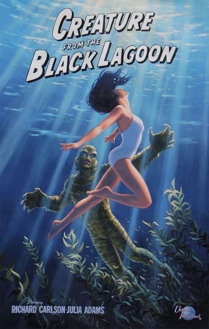
The good news is that legends like Greg Hildebrandt are still finding new ways to challenge and reinvent themselves. Having grown up devouring all the classics we did, the artist is now attempting a new series of “What-If” paintings. In April of this year, Hildebrandt imagined that he was hired by Universal Pictures in 1954 to concoct a one-sheet for The Creature From The Black Lagoon. He confined himself to the style parameters of the time and tackled the job with an eye on the past. The result is a stunning confrontation between Julia Adams and the Gill-Man.
Hildebrandt was just getting started. Next up, King Kong. RKO’s essential monster movie spawned a million wannabes, but they always failed to live up to the 8th wonder of the world. Determined to create something monstrous, Hildebrandt chose the rarely-seen-these-days format of the three-sheet. The beast took six weeks to paint, but it now proudly stands at 86 inches tall. If you want to behold the giant, Hildebrandt will have it on display at Booth #1764 at the New York Comic Con (October 4 – 7).
Getting the opportunity to chat with Greg Hildebrandt over the phone was an incredible delight. I could not possibly hide my enthusiasm, or the straight-up geeky thrill it was to converse with a man that had such a tremendous influence on my pop culture sensibilities. We talked about his new project at great length, and we discuss the future (or the past, as the case may be here) of where this series might take him.
Truly though, my favorite parts of this conversation delve into Hildebrandt’s passion for King Kong, The Creature From The Black Lagoon, and all those other beautiful monsters. We chat about his process as well as his feelings regarding the state of the industry today. And we spend a good chunk exploring the insanity of stone lithography. Whoa. That sounds like an insane task.
Here is our conversation in full:
Where did this “What If?” exercise begin?
I fantasized for years really about painting the movie posters of the movies that I grew up with and loved as a kid and young guy. You know what I’m saying? And it’s just one of those fantasies fulfilled. I just decided to start doing it. Now, is a better time than any other time, so now’s the time. Especially in the face of everything that we obviously are very much aware of, all this computer generated imagery now, and no more real artwork. You know?
The reign of Photoshop.
And that’s kind of like what the deal is there. Like, just to say, “Hey, look, this is painting.” It doesn’t make the movie look old, which I was told by one person making a film right now that he wanted to do artwork for his own film and one of the distributors said, “Nah, no, we’ll use computer … ” Why? “Because artwork makes the movie look old.” Is that crazy?
That kills me.
If it’s handmade it looks old, and that’s like, “No, no, no.” So, I say, “Well, that’s the triumph of HAL.”
Right, yes, absolutely.
Yeah, I mean, just the astronaut approaching HAL with the artwork, and the computer is assessing the art, right? “You’re getting better, Dave.”
Why start with Creature From The Black Lagoon?
I don’t know. That just kind of jumped forward in my mind for some reason. Well, look, I mean, I’ve always been obviously a fan of all those films. I’m a fan of the movie posters. Reynold Brown, of course, one of the main men for this kind of stuff. Look at all the stuff that he did though. The Creature, This Island Earth, The Incredible Shrinking Man, Man Of A Thousand Faces, Attack Of The 50 Foot Woman, Ben Hur … It goes on and on and on. The Time Machine, George Pal’s film, which is one of my favorite movies of all time. Yeah, so, I’ve loved all that stuff since I was a kid, and I don’t know …
He sort of just came forward for some reason, or I should say the creature did. And then it was like, well, come on, the prime one was Kong. I saw that in a rerelease because obviously I was born in ’39. It came out in ’33. My dad used to talk about it all the time. He had seen it, and it was like a mythical thing by the time I got to see it in the ’50s. I didn’t even believe that it was real. Oh, my God, a giant gorilla and dinosaurs. This is impossible, you know? So, that one became one that I wanted to do, and then talking it over with my agent Jean … We were together for like 40 years, it’s like she said, “Well, hey, do it the size of a three sheet.” You know? The old three sheets are what? 86 inches tall. It would be about 86 inches. So, perfect for Kong.
The three sheet, no one’s doing three sheets anymore.
No, not at all. Of course not. What posters do they use actually? I mean, where are they? God almighty, when you go back to guys like, more contemporary guys, even like Drew Struzan and Bob Peak. I mean, to say nothing of that long history of Bill Gold, that’s who we did the Harryhausen poster for. He goes back to Casablanca and Yankee Doodle Dandy, and the Laughton Hunchback, and all those other great films that he did posters for, 8 1/2, Fellini, and the Dirty Harry stuff. And then the one that Frazetta did for Eastwood.
Yeah, The Gauntlet.
Pure gold. You know?
Yeah, right.
The Gauntlet, yeah.
And the poster is better than the movie.
Yeah.
Are you aware of these limited edition poster places like Mondo, or Gallery 1988? Illustration seems to be alive there.
Yes, I am, so I think it’s a fantastic thing.
There’s a hunger for illustration again because the last … I don’t know, 30 years has all been digital garbage. Floating heads, blah.
Yeah, it’s all boring. It’s the same stuff just repeated.
When I see you coming and doing the Creature and Kong again, I feel like this is a perfect time for you to capture … or recapture your audience.
Things all work together, you know? It’s like, I’m glad to see that, that’s happening, and I’m becoming aware of it too, just what you’re saying, these groups and people who are into classic posters. I did an interview last year. I was going to the Jersey comic con, and a reporter asked me what do I think about this business of posters. And the question threw me because it’s the first time anybody had ever asked me that. I wasn’t even aware that people were aware of it yet. You get me?
Sure.
So, the time is right. I mean, Christ, I’ve loved those things since I was a kid. The fact that they used stone lithography, you know? Those were beautiful. When they did it all using stone. I don’t know if you’ve seen that process.
Just on YouTube.
I did one picture that way.
Really?
Yeah, in stone. Not for a movie poster. It’s a private commission.
That seems nightmarish.
Oh, it is. It was a means of reproduction that was common. That was just the way everything was reproduced, images, posters, movies, circus, labels on tomato crates. I mean, everything was done with stone, and that’s like up to the Second World War, and then that went away. And so, it was just a common means of reproduction. They never thought of it as a fine art, or an art form even, so to speak. It wasn’t until now.
I think there were three guys up to the one I did. I maybe did this 15, 20 years ago, and there were about three people in this country who were still producing stone posters. Now, it was an art form. Now, it was a completely different story. There were artists specifically choosing that medium to work in. Well, I mean, my God. This thing that I did was a seven-color separation, seven colors, and it was going to be on the three stones. So, basically a three sheet only printed on one piece of paper, you see? Tall, very tall.
There was a top head in the top section and then the folded arms in the middle section. It was a portrait type thing, and then on the bottom was a title, you see? Now, seven colors means seven times three stones. That’s what you’re dealing with. You have to do all your color separations in your eyeball and in your head, because you gotta transfer the picture that you’ve drawn. I’ve drawn a portrait, see, in penciled outline. It’s been blown up at Kinko’s to the size that I’m gonna paint … do the image. You transfer that onto all those stones now. Everything has to be positioned. You have your registration marks, and everything has to be exact. And then you have to break down where you gotta do … the three stones have gotta be your black plate. The next three stones are gonna be the color of the hair. The next three stones will be the skin color, and then the next … You see what I’m saying?
Right. Woof.
And you can only put on each of those stones … just like in color separation and the printing process of what goes on there. So, unless you’re used to that, I mean, unless you’ve done it many, many times, like these guys do, right? They did back in the day. I mean, it’s mind bending.
Yeah, I would need a serious stiff drink afterwards.
Yeah, definitely.
So, when you get done with that, do you go, “All right, well, I checked that box.”? Or do you have a desire to return to that process?
No, no, no. This was a job that … It was actually, like I say, a commission for a particular person. And people were recommending me. And then Jean says, “They want you to do stone lithography.” I says, “Stone? I don’t know what the hell that is.” Crap. And then, oh my God. Then I talked the guy, the lithographer. He was on the phone. He was in California, and he says, “Oh, you’re gonna love it. You’re gonna love the medium. Don’t worry about it.” So I got there, and I tested it. So, he gave me a small stone to work on. It’s like a heavy rock. You can’t move these things by hand. He had forklifts moving all the rocks around. You know what I’m saying?
You place one down. It’s smaller. He says, “Okay, now, here, here’s a series of grease pencils.” You are rendering it only in black, right? You only render in black because the ink will be used for each separate plate, so you are rendering them black. You got a series of soft to hard, so you can get really squishy and soft with it, or you can get really tight lined, you know? And so, I’m … oh, okay. I’m working on the stones.
It’s got a nice smooth toothed surfaced to it, which is really good to work on, and it’s hard. You’ve got a rock under your pencil, so it feels different than paper or board or anything. And then all of a sudden you kind of make a mistake. “Oh, where’s the eraser? Wait a minute, eraser?” It’s like you can’t erase. There’s no eraser. So, basically, there are no mistakes you can make in this whole damn long complicated process, because you can’t make a mistake.
I’ve never been on such a tightrope. On top of that this was like right after the major L.A. earthquake, the big one. And they were getting aftershocks.
Oh, no.
So, I’m in this guy’s shop, and it’s all an old building built around … I don’t know, the turn of the century, all brick. Just bricks stacked up on top of each other. No structure, or anything. And I’m waiting for the whole place to go down all the time. So, you’re hunched over … Fortunately, nothing happened during the day, but a couple aftershocks happened at night while I was sleeping. You’re warned by that, so your anxiety is now compounded.
Oh, man. I want a Mission: Impossible type movie just about that day. That’s fascinating.
So, anyway, that’s what I did. So, aside from the fact that I’d never done it before and was under the duress of pulling the medium off, that was going on. And it was just crazy, but in any event.
That’s fascinating.
Makes you look at those common reproductions of posters, right?
Right, yeah. What we take for granted.
Yeah.
So, getting back to King Kong. You’ve got the three sheet concept. It’s a film that is beloved. We all know every single frame of it. It’s been remade a couple of times. Where you do you start? It’s time for Greg Hildebrandt’s King Kong.
What the hell? The thing is, I gotta put myself back in the time so to speak. In other words, the style and structure of that period.
You’re trying to recreate the style of poster you would see in 1933, but also add your own stamp to it.
Yeah, exactly. It’s not that I’m, per se, trying to absolutely imitate that exact style so that, oh, my God, you can’t tell. Is that from the ’30s? No, I mean, but the structure. You know what I’m saying? The way it’s laid out, more or less.
Yeah, it’s kind of a triptych of sorts. Three scenes, well, four scenes from the film represented.
Yeah, and it was a big. With the main actors in that circle, which is always that ’30s sort of motif, you know? I put the type on the bottom for the cast, which is generally the way the little RKO layout logo. The main image I went for is the one that I loved when I saw it for the first time. I was probably … what? 14 years old I think? 14, or 15. And come on, King Kong, the giant gorilla fighting a T-Rex.
Yeah, it’s my favorite moment. Probably a lot of kids’ favorite moment.
Oh man. That’s the ultimate scene for me as a kid back then, because I went home, my brother and I, we were totally into stop motion animation. That’s what triggered that off. So, that was one of the side junkets that we took as young guys. We did special effects, animation. We were painting, drawing, you name it. We started to build a T-Rex animated puppets with ball joints. Crude as it was, you know? Because we got an eight millimeter camera, and we would go shoot stop motion stuff. But the thing is, to take on the posters … That was the main image for me. I wanted him on the Empire State Building, so you got those two big major setups. There’s the island that he’s from, and the jungle, and surroundings, and a bit of a wall showing up. That always was fantastic.
Yeah, and you got the pterodactyls up top. I mean, you really put the whole movie into one poster.
That again being the objective, right?
Right.
And a book cover is that, pulp covers were always that, right? For paperbacks, you know? To sort of sum it up, if you can, and it to be the hook to pull you in. That was always the concept. So, and then of course, you’ve got the three principle actors. That’s basically who you want to show. And that’s kind of like it. But the thing for me too, is doing Kong himself. It’s like, you’re not painting a gorilla here. So, you’re not going to mountain gorillas in Africa to copy from at all. This is Kong. He’s a Willis O’Brien’s stop animation puppet.
Yeah, there’s only one.
That’s exactly what he is. He’s 18 inches tall, but he has a personality that the sculptor gave him. That’s what I was trying to go for. That’s what I tried to stick with. And also, the T-Rex, even though I’ve got models of T-Rexes and stuff, it’s … O Brien’s design. He’s a much thicker creature. That’s streamlined one that we see, like in Jurassic and what not, more of a scientific reconstruction. These were just sort of like fantasy creatures in a sense. Three times bigger than a real one, right? On the island. But anyway, so that’s what I went for.
Your Creature From The Black Lagoon image is a lot different. It’s Julia Adams and the Creature. Boom, done.
Yeah, exactly. And there was several modes that I started the design for that. This is before I even thought about it, or saw, or heard of Shape Of Water. There’s the terror aspect of this creature coming up after the girl, and then there’s the more romantic aspect, because the creature is the guy that really is falling for the girl in this. That’s the one I stuck with. I wasn’t after a horror scene. Do you get me?
Uh-huh.
That would be a completely different setup and different lighting, and different angles, different everything, if you want to go for that. You know? This is more subtle.
Do you see you reproducing these for sale?
We can’t really reproduce them, because we don’t have the rights. It’s all about the original for me. That’s about what it comes down to. They’re gonna be one and only. That’s it.
But you have a list of 100 titles that you want to get to eventually?
Oh, that’s just probably scratching the surface. And they’re all over the place. It isn’t just science fiction and fantasy. It’s lots of stuff. One of the key ones, the early ones, of a film that impacted me … I was only real young kid … Christ, I didn’t even understand it. My dad liked more kind of films, the heavy duty ones too. And he’s come home from work and would take me to the movies. And we went and saw, of all things, Nightmare Alley.
Oh, damn, yeah.
You’re talking about the ultimate noir. That thing has been in the back of my head since I was a little kid. And you know, I didn’t understand it. I mean, it’s a complex idea, alcoholism, addiction, the con artist, religion, and psychiatry, right? Fantastic, incredible. And so, that’s one. And I’ve roughed that all out already. I’ve comped that all out.
And there’s the geek, of course. That’s gonna be in the poster. The real one, if you remember it … I don’t know if you remember it, it’s very simple. It’s Tyrone Power up close with a cigarette hanging out of his mouth, and it’s three principle women behind him. Just all head shots. Painted, beautifully done, but they completely stayed away from that aspect of the con artist, charlatan monster, in a sense. You know? Like the geek poster in the film says … What the hell does it say again? “Body of a man. Soul of a beast.” And that’s the take that I was going for in my poster. So, you’re gonna see the geek.
That’s rad.
You’ll see both sides of his personality.
Okay, so, you’re creating your wish list. Process wise, you’re putting the comps together. How long are you spending with each painting?
It varies. The Kong one took a lot longer than The Creature one did.
Oh, really?
I’ll spend a lot of time just coming up with layouts. The Kong thing, it just doesn’t just leap out the first cut. For me it doesn’t anyway. At least not these. Because that thing is so long in my head … in your head, our heads, “Oh, my God. Where do I start?” I feel the same way. I approach a blank piece of paper. It’s like, “Oh, my God, what do I do? Where do I start?” Just start drawing. You start moving your pencil around and shit happens. So, let it all flow out. You don’t really think too hard. It’s like you try not to think really, just start moving the pencil around and see what happens. And eventually just sort of like … I don’t know, God knows how many roughs I did. In a nutshell, it’s about two months for that one. Two months for that one.

Don’t forget to visit Greg Hildebrandt and Kong at Booth #1764 at the New York Comic Con (October 4 – 7).