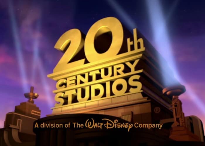
It was only a matter of time before Disney started rebranding its Fox acquisitions. Going forward, Fox Searchlight will be known as Searchlight Pictures, while 20th Century Fox will be called 20th Century Studios. The logos for each will remain largely the same, but the changes represent a new era in filmmaking under the ownership of the House of Mouse. The new era commenced with the release of The Call of the Wild, which will go down in history as the first film to be released under the 20th Century Studios banner.
The change is Disney’s way of disassociating itself with the Fox outlets that still exist (Fox Broadcasting Company, Fox Television Stations, Fox News, Fox Business, and Fox Sports), which are a part of Rupert Murdoch’s also newly rebranded media entity, Fox Corporation, sister company of Murdoch’s News Corp. Disney also understands the importance of promoting its own brand, and the Fox name might not correspond with that desired image.
But not everyone is happy with the updates, especially in regards to the 20th Century Fox logo being tinkered with. The logo represented 85 years of motion picture history and appeared at the start of some of the most iconic movies ever made. Many film buffs associate it with Star Wars, Die Hard, and Alien, and this development is viewed by some as Disney’s way of diminishing a studio’s legacy.
It’s going to take a minute for some people to get used to the new logo and all of the changes associated with it. That said, this isn’t the first time something like this has happened in relation to this particular logo.
The iconic gold emblem was created in 1933 by Emil Kosa Jr., a matte painter whose other famous works include the ruined Statue of Liberty shown at the end of Planet of the Apes. However, the logo was originally used for Twentieth Century Pictures, which merged with Fox in 1935 after William Fox lost control of his company. After the deal was finalized, the “Pictures, Inc.” part was replaced with “Fox” and the rest is history.
In the years that followed the merger, the logo was also reworked by other artists to keep up with the times. This began with Rocky Longo, who repainted the logo in 1953 to coincide with the studio releasing movies in the widescreen Cinemascope format, starting with How to Marry a Millionaire.
While logos being repainted isn’t the same as an entire word being replaced due to a change in ownership, the differences aren’t too great either. The Fox logo has been subtly modified several times throughout the years to reflect a change of some kind, and not all of those differences were too popular. Over time, though, people got used to them, and they all became a part of the studio’s 85-year legacy in their own way.
Interestingly enough, the 1935 version of The Call of the Wild was the first of Twentieth Century Pictures’ releases to open following the announcement of the Fox merger, and it was one of the last films still put out under that banner and with its logo. It’s quite fascinating that two adaptations of the same Jack London novel have been released when change is in the air with the legacy of the Twentieth Century studio. While the new movie’s timing could be coincidental, it feels quite poetic that the company has come full circle.

